Aivida
Visual Identity System for Physical AI Solutions
Brand
Aivida
Role
Brand Designer
Industry
B2B Physical AI
Summary
Aivida had the technology but no visual language to match it. I built a complete brand identity system from scratch, creating a visual metaphor rooted in the company's core technology that could scale across every touchpoint consistently.
Context
Aivida integrates AI, radar, and sensor technologies for industrial sites, smart cities, and senior care. Despite rapid growth, the lack of a cohesive visual identity undermined its credibility with B2B stakeholders.
The Challenge
Create a distinctive visual identity that could scale across CI, color systems, typography, and all editorial touchpoints, while communicating both technical precision and human warmth.

My Approach
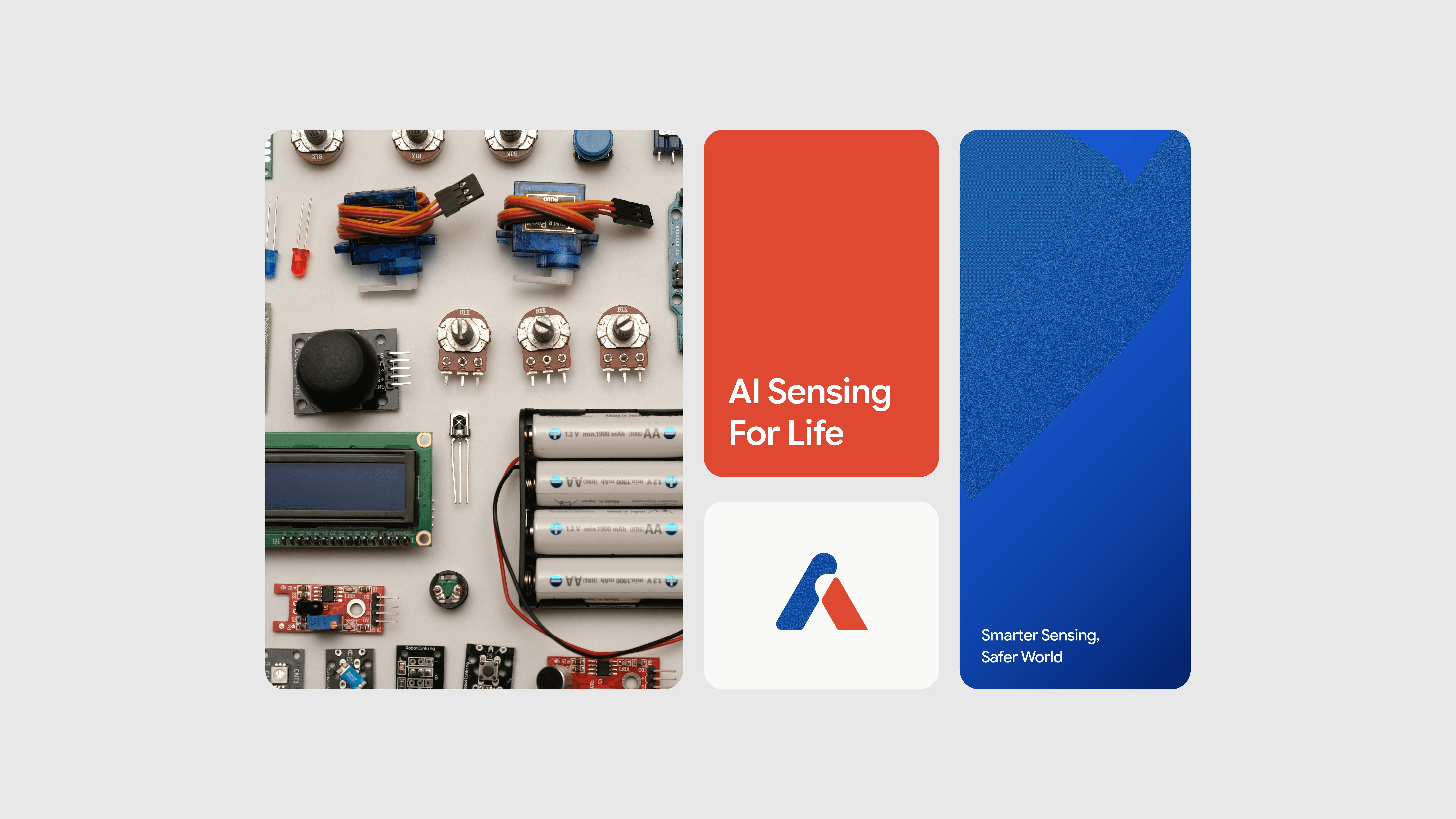
The symbol went through three initial directions: an A-shaped mark, a radar-inspired form, and a heart symbolizing human-centered technology. Each captured part of Aivida's identity, but none captured all of it. The client wanted something more distinctive. After 9 rounds of exploration, the final symbol merged all three concepts into one, the character 人 (human) combined with the letter A, with a 60° angle derived from radar's standard 120° Field of View. Three meanings, one mark. For color, the exploration ranged across multiple combinations before landing on a clear logic: blue to represent technology, orange to represent human warmth. The tension between precision and care became the foundation of the entire color system.

Solution
• Built a brand symbol merging the character 人 (human) with the letter A, with a 60° internal angle derived from the standard 120° radar Field of View, embodying focused intelligence. • Developed a four-color system: Aivida Blue for innovation, Deep Navy for trust, Warm Ivory for balance, and Coral as a human-centric accent. • Scaled the identity across CI, business cards, technical documentation, and all digital and physical touchpoints.


Impact
• 100% visual consistency across all digital and physical touchpoints. • 30% reduction in design production lead time through standardized guidelines.

